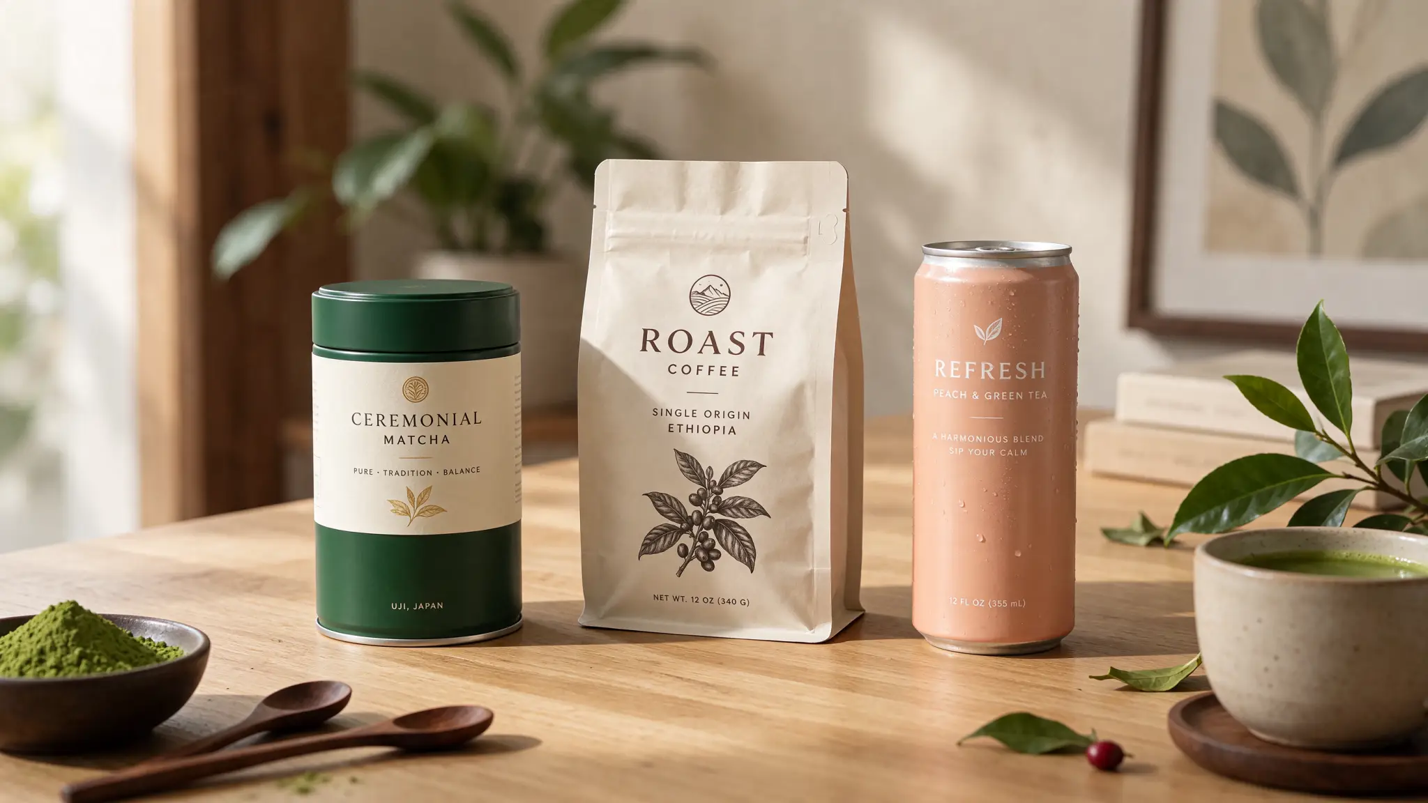
Nothing gives away an AI-generated product mockup faster than melted lettering on a bottle label or a poster subheading where two letters fuse together. Earlier models forced designers to generate blank containers, export to Illustrator, and manually warp labels onto curved jars—a tedious detour when you just want to test five packaging concepts or restaurant menu cards in ten minutes.
Seedream 5.5 brings a major jump in character-level layout accuracy across English, Chinese, Japanese, and bilingual designs. Inside the PixTV image workspace, you can draft typographic layouts at 1K (3 credits) and render crisp final packaging mockups at 2K (5 credits). Here is how to structure your typography prompts so spelling, kerning, and surface perspective hold on the first pass.
The 4 Prompt Rules for Zero-Typo Layouts
Whenever a prompt includes rendered text, follow four formatting habits before hitting generate:
Always wrap exact strings in double quotation marks (
"..."). Never let the model improvise brand copy. Instead of a coffee bag with artisan roast text, writeprinted with bold black text reading "HIGHLAND ROAST".Assign each text string an explicit anchor zone and hierarchy. Separate
top headline,center label title, andbottom corner badgeso two strings never compete for the same negative space.Describe how the text interacts with the physical surface. Flat digital overlay text (
clean white overlay headline in the top margin) looks very different from physical packaging print (gold foil-stamped serif lettering debossed into textured green paper box).Cap single-turn density at 3 distinct text blocks. If a menu or poster needs five or six separate callouts, lock the main title and hero product in Turn 1, then add secondary price tags or badges in Turn 2 using Seedream 5.5's multi-turn editing.
Typography Style Glossary for Seedream 5.5 Prompts
Instead of naming proprietary font files that AI models cannot license directly, use descriptive typographic terms paired with finish cues:
Desired Brand Aesthetic | Prompt Phrasing That Works Reliably | Best Surface / Finish Pairing |
|---|---|---|
Luxury Skincare / Fragrance |
| Matte cream paper label, blind deboss, or subtle gold foil |
Modern Tech / SaaS / Streetwear |
| Flat negative-space overlay or brushed anodized aluminum |
Craft Food / Café / Bakery |
| Kraft paper pouch, ceramic glaze stamp, or textured menu card |
Bilingual Poster (EN + CJK) |
| High-contrast solid color margin or subtle dark gradient |
Mistake vs. Fix: Why Dense Packaging Copy Crowds Together
When designers complain that small text looks cramped, the culprit is almost always trying to render five lines of tiny copy on an angled box in a single 1K pass.
Use the Two-Turn Staged Copy Fix instead (total cost: 8 credits):
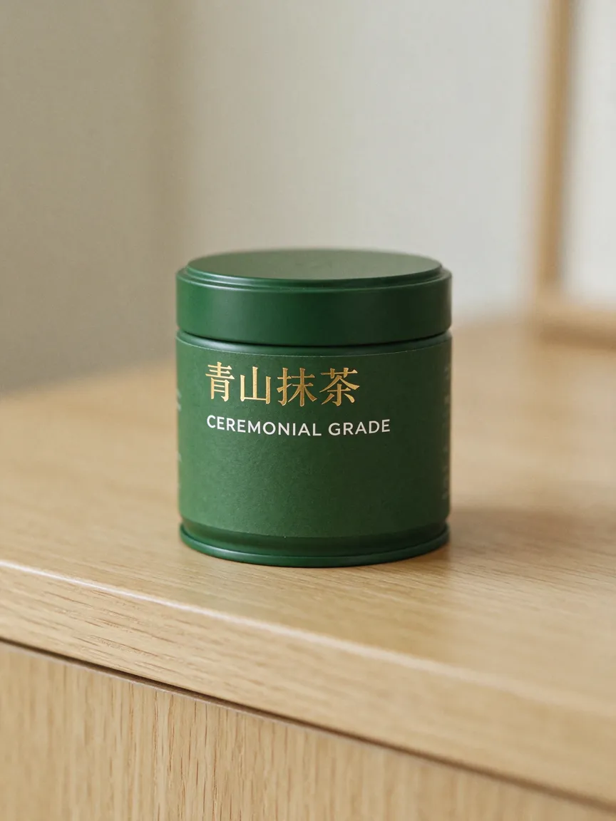
Turn 1 — Lock Packaging Geometry & Primary Brand Mark (
1K, 3 credits):
Studio product mockup of a matte forest-green cylindrical matcha tin on a pale oak counter. Front label features clean gold foil Chinese headline "青山抹茶" above crisp white uppercase English text "CEREMONIAL GRADE". Soft diffused side lighting, clean uncluttered lower label area.
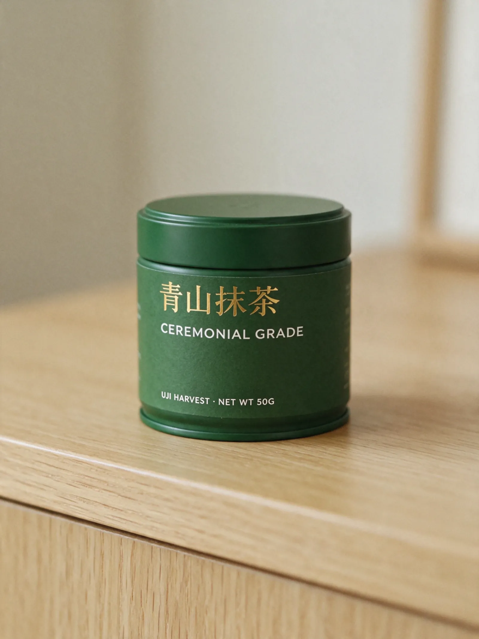
Turn 2 — Add Fine Print & Export at
2K(2K, 5 credits):
Keep the matcha tin, lighting, and "青山抹茶 / CEREMONIAL GRADE" lettering identical. At the bottom of the front label, add small clean white sans-serif text reading "UJI HARVEST · NET WT 50G".
Because 2K costs the exact same 5 credits as 1.5K on PixTV, jumping straight from your 1K layout check to 2K on the final turn sharpens tiny 50G characters dramatically.
Turning Labelled Products Into Commercial Video Ads
Printed labels are usually the first detail to melt or warp when you animate a product photo into video. If you are building AI restaurant menu ads or skincare product videos, prepare your 2K Seedream 5.5 frame with two motion precautions:
Keep label text facing within 30 degrees of the camera. Extreme side-angle foreshortening makes video models guess letter shapes as the camera moves.
Use restrained push-in or lighting motion in Seedance 2.5 or Kling 4.0. Once you connect your
2Kframe to a PixTV video node, prompt gentle camera glide, liquid pour, or drifting steam rather than spinning the bottle 360 degrees.
Frequently Asked Questions
Why does small label text look sharper at 2K than 1K in Seedream 5.5?
Fine serif strokes and small uppercase subcopy need enough pixel grid density to separate adjacent characters like R, B, and 8. Draft overall poster placement at 1K (3 credits), then always render final text-heavy visuals at 2K (5 credits).
Can Seedream 5.5 curve text naturally around bottles, cans, and coffee bags?
Yes. Specify the container geometry (cylindrical aluminum can, curved amber glass jar, creased matte stand-up pouch) alongside printed on the front label rather than poster headline so Seedream 5.5 wraps the lettering along the surface perspective and lighting falloff.
What if I need a 4K print poster with typography on PixTV?
Seedream 5.5 supports up to 2K resolution on PixTV. For large-format 4K print sheets, check our Seedream 5.5 vs. Nano Banana Pro vs. GPT Image 2.6 comparison to see when to pair Seedream layouts with 4K flagship models on the same canvas.